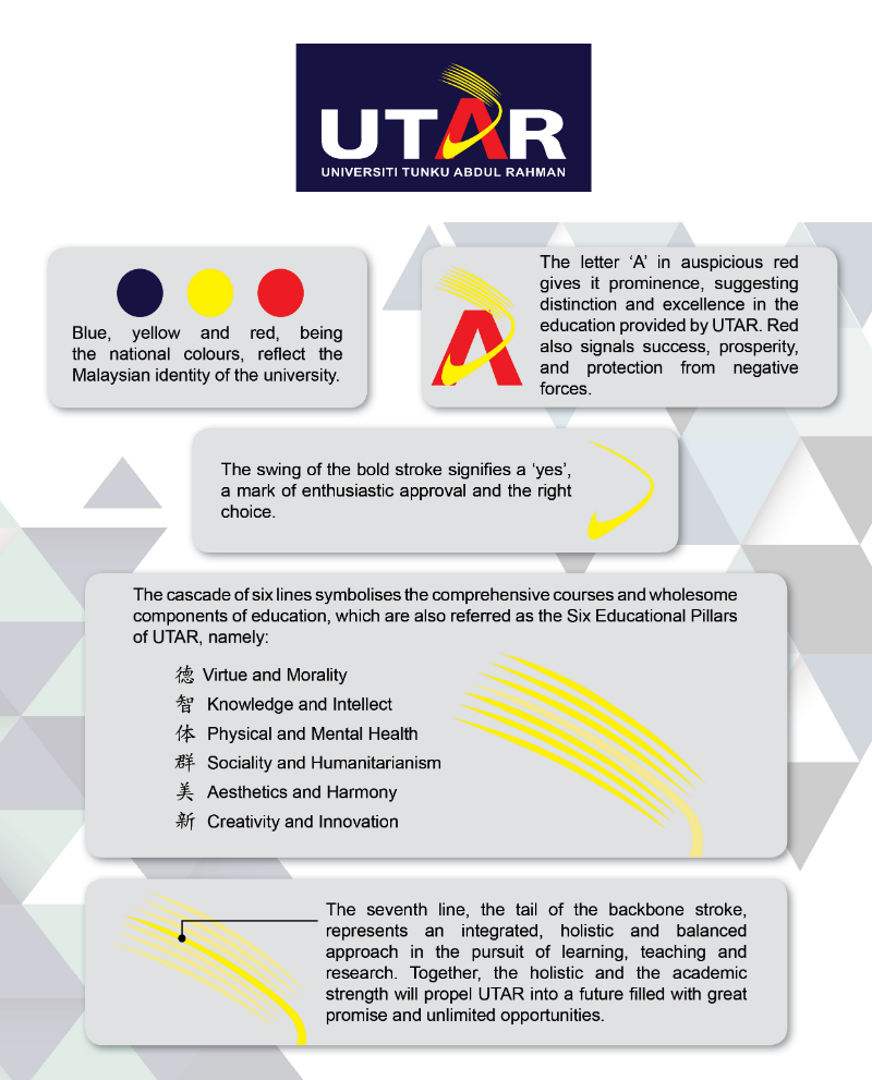
UNIVERSITI TUNKU ABDUL RAHMAN

UTAR Logo
UTAR Hospital Logo
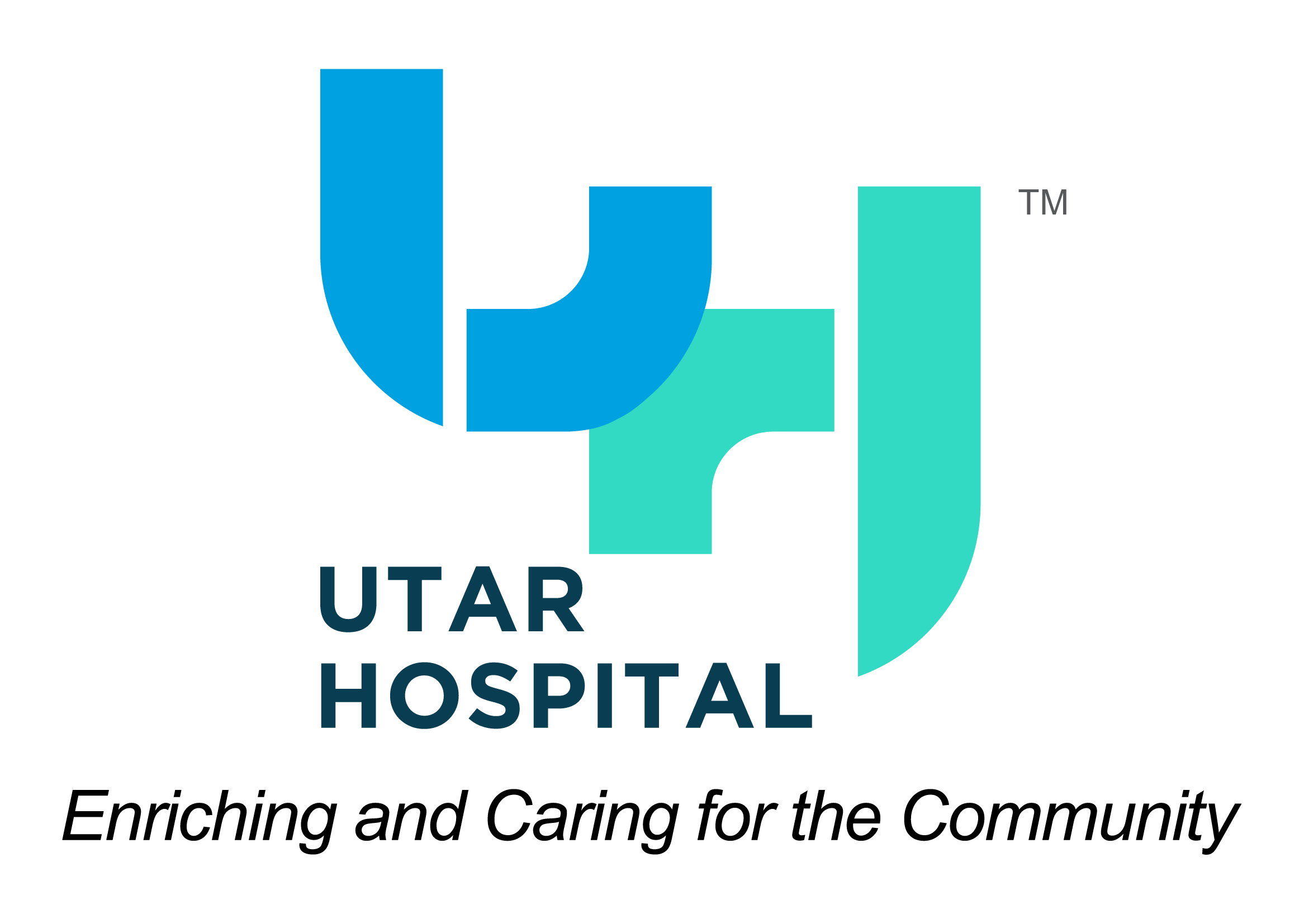
The letters “U” and “H” in the UTAR Hospital logo stand for “UTAR” and “Hospital”. At the same time, both letters also represent the doctor and the patient. The letters “U” and “H” overlap, signifying the integration of Contemporary Medicine with Traditional Medicine, and connect (the roles of) the doctor and the patient working together to build a healthier society. The blue colour in the logo represents intelligence and responsibility while the green colour represents healing and new beginnings.
UTAR 20th Anniversary Logo

The colours used in the logo are derived from the UTAR logo colours of blue, red and yellow which indicate the Malaysian identity of the university. Blue symbolises commitment and the future. Yellow symbolises intellect and quality. Red symbolises strength and passion. The blue illustration of the logo replicates the Chinese characters "二十" (Twenty), with one of the strokes depicting the rising wings of the Phoenix. The UTAR logo at the base symbolises the foundation of strength and resilience while the rising wings of the Phoenix symbolises the dissemination of knowledge and the advancing growth of the university. The logo embodies UTAR's 20 years of inspiring educational excellence while forging ahead with continuous commitment to quality education, research and innovation, contribution to the community and sustainable growth.